|

|
|
|
|

Reklama
3D tiskárny


AONN.cz

Spřátelené Weby


|
3D modely ARTArsenal Crest at The Emirates Stadium, London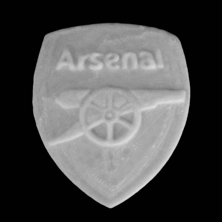
In 1888, just two years after the formation of the Club, Arsenal, then called Royal Arsenal, adopted its first crest (2). This was based largely on the coat of arms of the Borough of Woolwich (1).The Club was based in the Borough from its formation until 1913, playing at Plumstead Common; Sportsman Ground; Manor Ground; Invicta Ground and the Manor Ground again before heading across London to Highbury, Islington prior to the move to Emirates Stadium. The original badge comprised three columns, which, although they look like chimneys, are in actual fact cannons. The significance of the cannons to the Borough of Woolwich derives from the long military history surrounding the area. The Royal Arsenal, Royal Artillery Regiment and various military hospitals – which still dot the landscape today – were all prominent in the Borough. image: http://www.arsenal.com/assets/_files/images/jan_13/gun__1358428314_crest_history1.png 1) The Coat of Arms of the Metropolitan Borough of Woolwich2) Royal Arsenal's first crest, 1888 The cannons on the original crest were obviously a reference to the military influence in Woolwich and despite the Club’s ties with the area being cut 89 years ago, the cannon theme has developed throughout the years and has remained prominent on the Gunners different crests down the years, including the new design. In the early days the crest was not as significant a part of a football club’s identity as it is today. Shirts remained plain, unless commemorating a significant match, an FA Cup Final for example, and the crest was generally reserved for official headed stationery, matchday programmes and handbooks. Following Arsenal’s move north to Highbury in 1913, it wasn’t immediately apparent that the Club would embrace the Woolwich Arsenal legacy and keep the cannon as a recognisable motif. The Club soon became just ‘Arsenal’, the Great War affected football for four seasons and recommencing in 1919/20 ‘normal’ football took some time to settle. During all of this period there was no sign of a crest as such but, in the first matchday programme of the 1922/23 season, when the Gunners played Burnley, a new club crest (3) was revealed – a fearsome looking cannon – that would have sat proudly in the Royal Arsenal of Woolwich. As can be seen the vertical cannons have gone with the new design featuring a single eastward pointing cannon. Whoever designed this robust looking weapon saw his handiwork used by the Club for just three seasons however, and for the start of the 1925/26 season, the Gunners changed to a westward pointing, narrower cannon (4) with the legend ‘The Gunners’ remaining next to it. image: http://www.arsenal.com/assets/_files/images/dec_13/gun__1387275046_crest_history2.png 3) Club crest 1922-1925. 4) Club crest 1925-1949 The derivation of the narrower cannon has never been officially confirmed, but the cannons on the crest of the Royal Arsenal Gatehouse in Woolwich (5) are uncannily similar to that used as the Gunners’ symbol. This cannon crest remained prominent in the Arsenal matchday programme and other publications for 17 seasons. It changed slightly through the years with the wording eventually disappearing, but, despite being usurped by the Victoria Concordia Crescit crest in 1949 it has remained a basic symbol of the Club ever since, featuring on official merchandise and stationary throughout the years right up until the present day. image: http://www.arsenal.com/assets/_files/images/apr_14/gun__1397470894_crest_history3.jpg 5) The Royal Arsenal Gatehouse in Woolwich. 6) The first VCC 'Victoria Concordia Crescit' crest, 1949 The VCC crest (6), which the current crest replaced, had been Arsenal’s symbol since appearing in the first programme of season 1949/50. It would appear to have been in the minds of the Gunners hierarchy for at least a year prior to this. In the final matchday programme of the 1947/48 League Championship winning season, ‘Marksman’ (aka Harry Homer), the programme editor of the day, wrote: “...my mind seeks an apt quotation with which to close this season which has been such a glorious one for Tom Whittaker, Joe Mercer and all connected with The Gunners. Shall we turn for once to Latin? ‘Victoria Concordia Crescit’. Translation: ‘Victory grows out of harmony.’” Two seasons later and Arsenal unveiled its new crest which incorporated Marksman’s Latin maxim. Tom Whittaker explained in the 1949/50 handbook (which also included the new crest) that the Club had been impressed by Marksman’s motto and it had now been officially adopted by the Club. The new crest also featured ‘Arsenal’ in a gothic style typeface, the westward facing cannon, the Borough of Islington’s coat of arms and ermine. image: http://www.arsenal.com/assets/_files/images/jan_13/gun__1358428344_crest_history4.png 7) A later version of the VCC crest. 8) 'Cleaned up' VCC crest, 2001 For the next 53 years this crest remained largely unchanged (7), though at the start of the 2001/02 season it was ‘cleaned up’ somewhat (8) for commercial reasons, with a solid yellow replacing the different tones of gold and Victoria Concordia Crescit written in a less ornate typeface. The Club’s identity has thus evolved over the years and the decision to formulate a new crest (9) in 2002 was two-fold. Firstly, as the VCC crest incorporated many separate elements introduced over a number of years, there was uncertainty surrounding its exact origination. Consequently, the Club was unable to copyright the crest. Secondly, it had always been one of the Club’s primary objectives to embrace the future and move forward. With Emirates Stadium on the horizon and the Gunners consistently challenging for domestic and European honours, the Club believed it was the ideal time to introduce a new crest. image: http://www.arsenal.com/assets/_files/images/jan_13/gun__1358428366_crest_history5.png 9) Current Club crest used since 2002. 10) 125th Anniversary crest The shirt for the 2011/12 season featured a special 125th anniversary crest design (10) combining the graphic of the first Club crest with the current version. The celebratory design features 15 laurel leaves to the left side of the Club's crest to reflect the detail on the reverse of the six pence pieces paid by 15 men to establish the Club - the laurel leaves also represent strength. The 15 oak leaves to the right of the crest acknowledge the founders who would meet in the local Royal Oak pub. Underneath the crest is one of the first recorded mottos related to the armament and battle - 'Forward' - with the anniversary dates of 1886 and 2011 either side of the heart of the shirt. THE ART DECO CREST It was inlaid into the floor of the 'Marble Halls', it sat proudly over Highbury's main entrance on Avenell Road and was even forged onto the heavy steel doors themselves. The hexagonal Art Deco "A-football-C" symbol has been synonymous with Arsenal Football Club since the 1930's and still appears today on scarves, badges and mugs in the Club shop; but what do we know about the history and design of this stylish Art Deco symbol? image: http://www.arsenal.com/assets/_files/images/jan_13/gun__1358940562_artdecocrest1.jpg The Art Deco Crest above Highbury's main entrance Britain's leading authority on football stadia and author of 'Football Grounds of England and Wales', Simon Inglis, explains further... "When Herbert Chapman took over the Club in 1925 it took him a little while to appreciate what the possibilities of a club in central London were. "One of the first things Chapman and Claude Waterlow Ferrier [the architect of Highbury's East and West stands] did was to "rebrand" the Club. "They created the symbol with the 'A' (standing for 'Arsenal'), the ball ('Football') and the 'C' ('Club'), which is in itself a fantastic piece of corporate branding. "You look all around Highbury and you see examples of that. Taking football from the Victorian era into the 20th century. This is what Highbury embodied, the synthesis between architecture and innovation." Although Chapman died two years before the iconic East Stand was opened his legacy and the symbol he helped to create live on. náhodnĂ˝ vĂ˝bÄ›r modelĹŻ
|
©Ofrii 2012
     | |||